Cruz Development, a luxury custom home builder in Arizona, approached me with no existing brand identity. The founder had a strong sense of the aesthetic he wanted bold, sleek, and refined, based in the his current builds. He also had a preference for a specific color palette inspired by the materials and tones used in his projects.
During our initial discovery session and through a detailed questionnaire, it became clear that the brand needed to reflect precision, luxury, and architecture. The client was open to being represented by “Cruz,” “CD,” or simply “C,” which guided the direction of my initial sketches.
From those early concepts, we quickly moved into rough vector explorations to help visualize the brand in a more tangible way. The client responded enthusiastically, particularly to the bold and structured forms. However later he decided that he wated to explore a second round of concepts focused on more luxurious interpretations of the “CD” monogram. I went back to the drawing board (see lighter blue sketches and bottom row of refined vectors).
To differentiate Cruz Development in a competitive market, I recommended leaning into a bolder, more architectural identity. Through iterative feedback, we ultimately landed on a refined mark using “CRZ”, a stylized abbreviation that felt both modern and distinctive. The following are the last iterations of the logo mark with type.
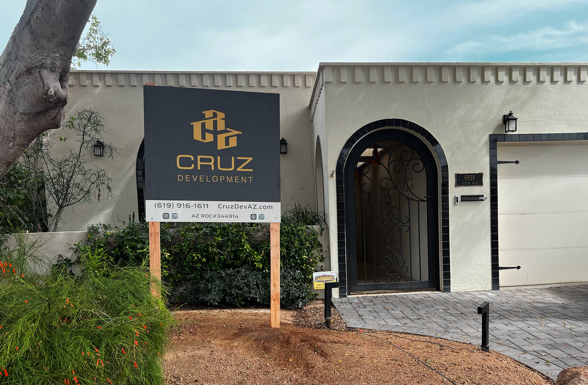
The final logo is abstract and architectural, representing a custom-built home in the letters CRZ. It balances masculinity with elegance, and speaks to the nature of Cruz Development’s work. The result is a brand identity that feels confident and high end. The final deliverables for this brand was a comprehensive brand guide, logo animation, stationary, and signage.
